

The Challenge
B.A.T needed a visual identity that could establish trust and credibility as a freight brokerage connecting shippers and carriers — while making the name itself unambiguous, since “BAT” read as a standalone word rather than an acronym.
What We Built
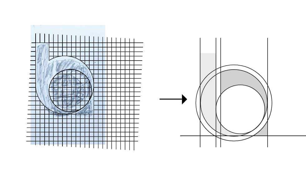
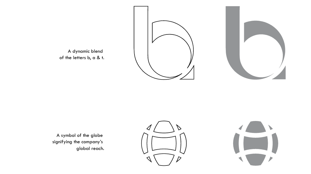
A full brand identity system centered on a custom logo mark blending the letters B, A, and T into a globe motif, paired with a deep blue and gold color palette, dedicated typography hierarchy, and a complete guidelines document covering logo construction, usage rules, and application across stationery, merchandise, vehicles, and signage.
The Outcome
B.A.T now has a cohesive, professional brand system ready for real-world deployment — from business cards and freight bills to vehicle wraps and building signage — reinforcing reliability and global reach across every customer touchpoint.
The Brand



The System
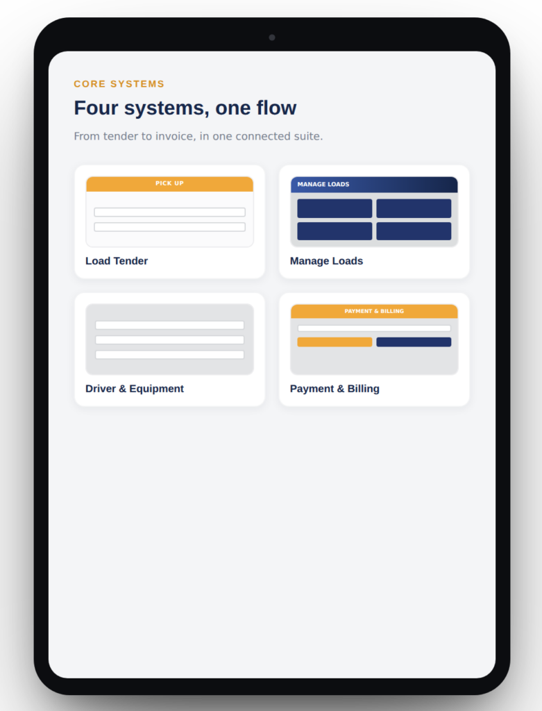
Four systems, one dispatch flow.

Systems that adapt to the screen.
Systems built, mobile-first.
